Where I got it
I have been watching reviews of this palette ever since it came out. There have been good and not so good reviews, but hardly any bad reviews generally. Most of the not so good ones were because they didn’t prefer either the naming of the shades or the cool-tones of this palette. After owning my first Natasha Denona Bronze palette, I really loved the quality and the packaging just gets me.
It launched about a month ago in early September I think and it was $125 on Sephora.nz. I knew Sephora does sales quite often and I could wait. When Sephora does a 20% off any orders over $150, I quickly put this into my basket along with a Zoeva powder brush I have been wanting to try. I placed the order on Thursday morning and it arrived on Friday morning all the way from Australia!
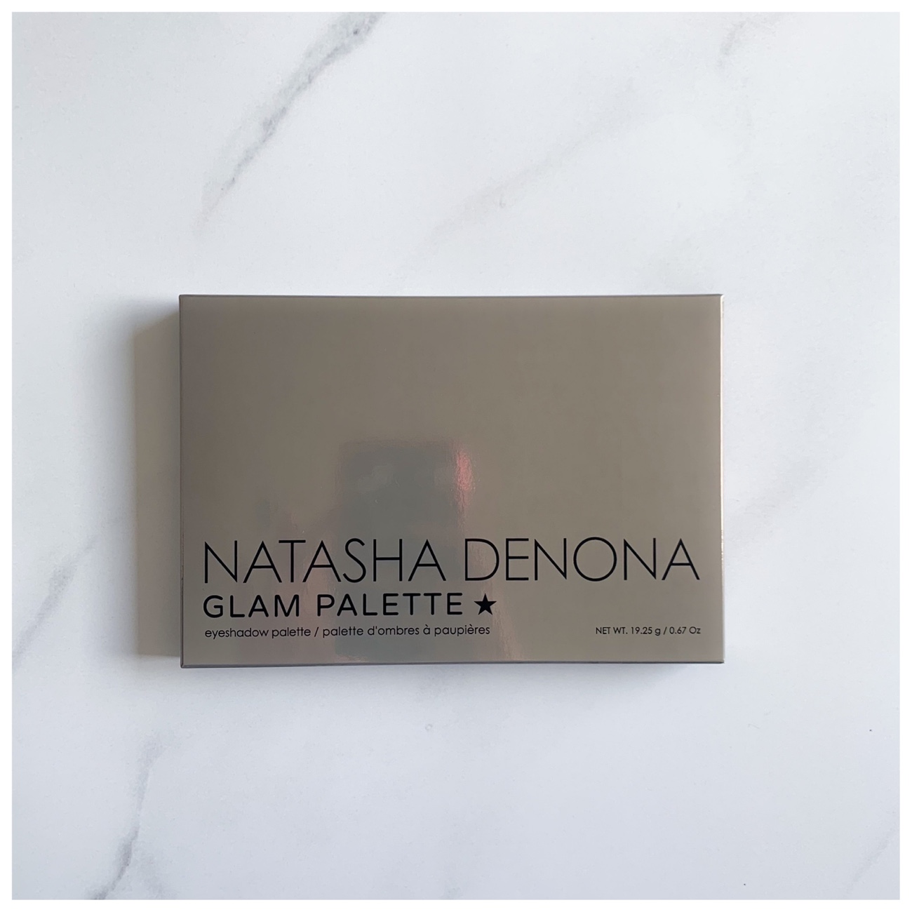
Natasha Denona Glam Eyeshadow Palette
Natasha Denona Glam Eyeshadow Palette
What I got
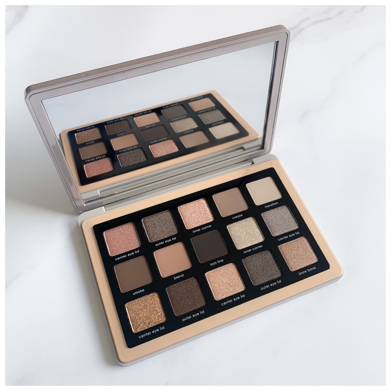
This is the Natasha Denona Glam Eyeshadow Palette (19.25g total). Introducing the ultimate, must-have palette featuring 15 brand new cool & neutral shades, designed to create a variety of looks – from natural everyday to extreme glam and dramatic smokey eyes.
Presenting special insider makeup tips from Natasha Denona herself, each shade is labeled to guide you while creating your look. Since the palette includes the option to pop-put and rearrange the shades, you can customize your own constellation to suit your preference and skin tone!
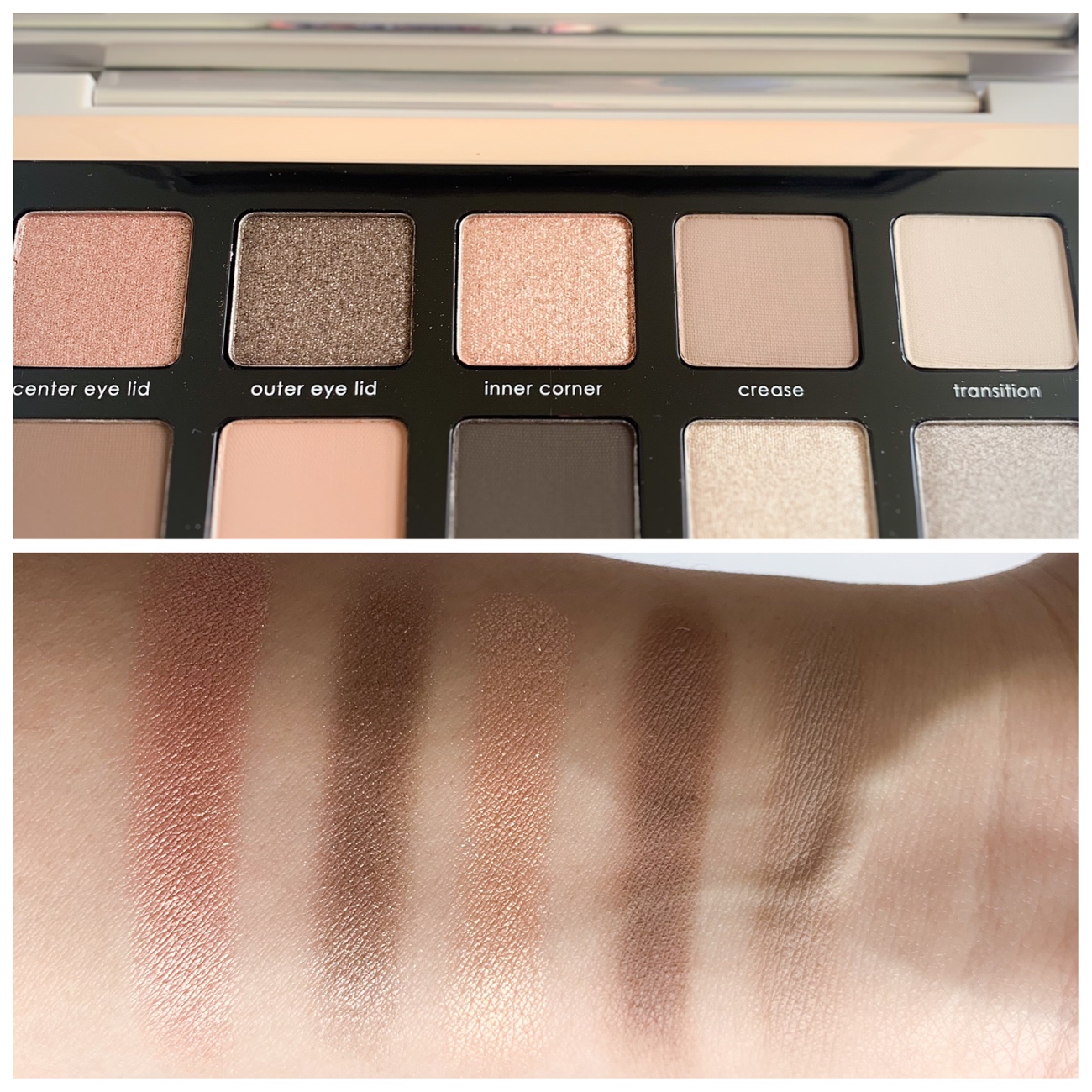
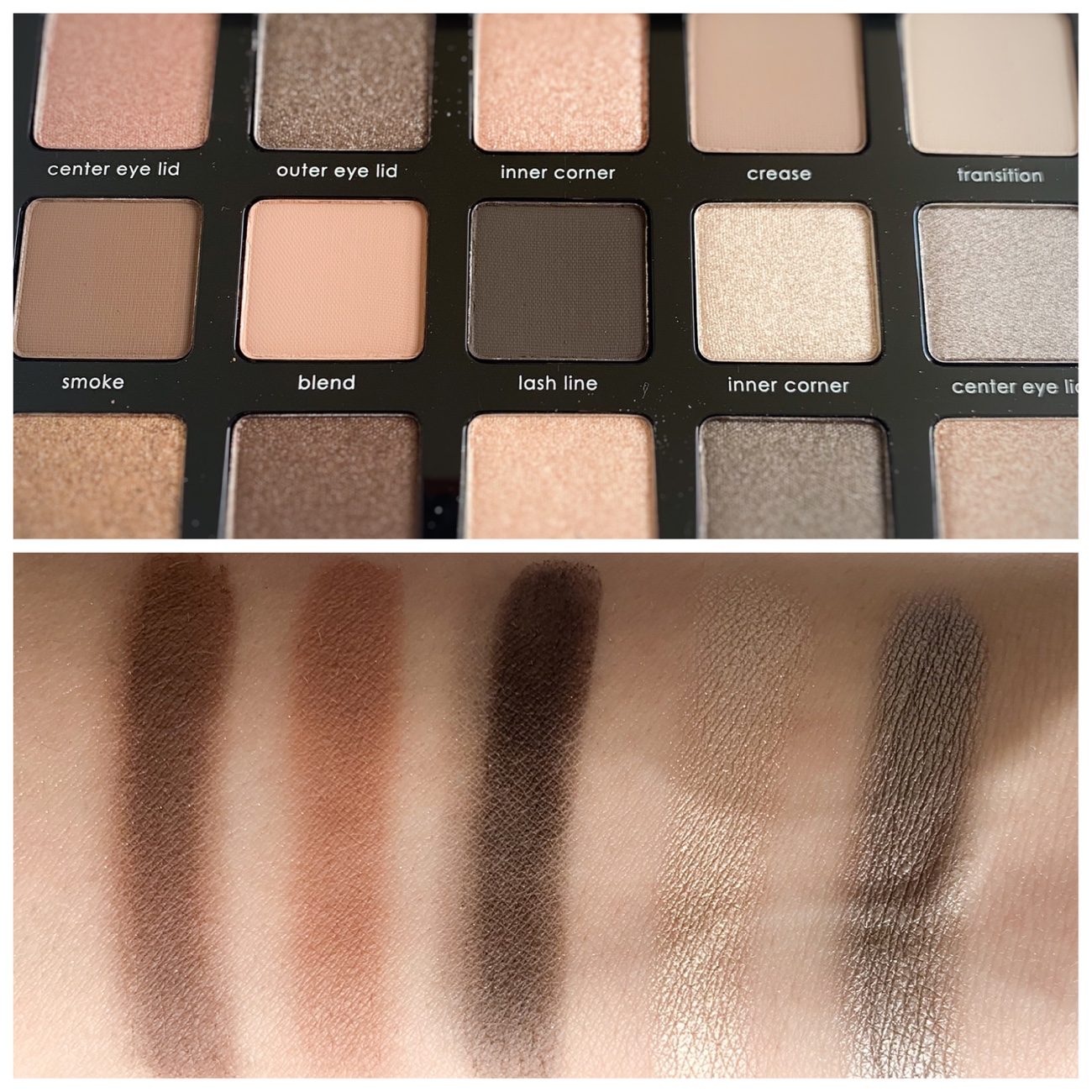
Top row: 320M – warm-toned, medium pink, 321M – warm-toned, light-medium taupe, 322K – warm-toned, medium peach, 323CM – neutral-toned, medium-dark taupe, 324CM – warm-toned, light-medium gray.
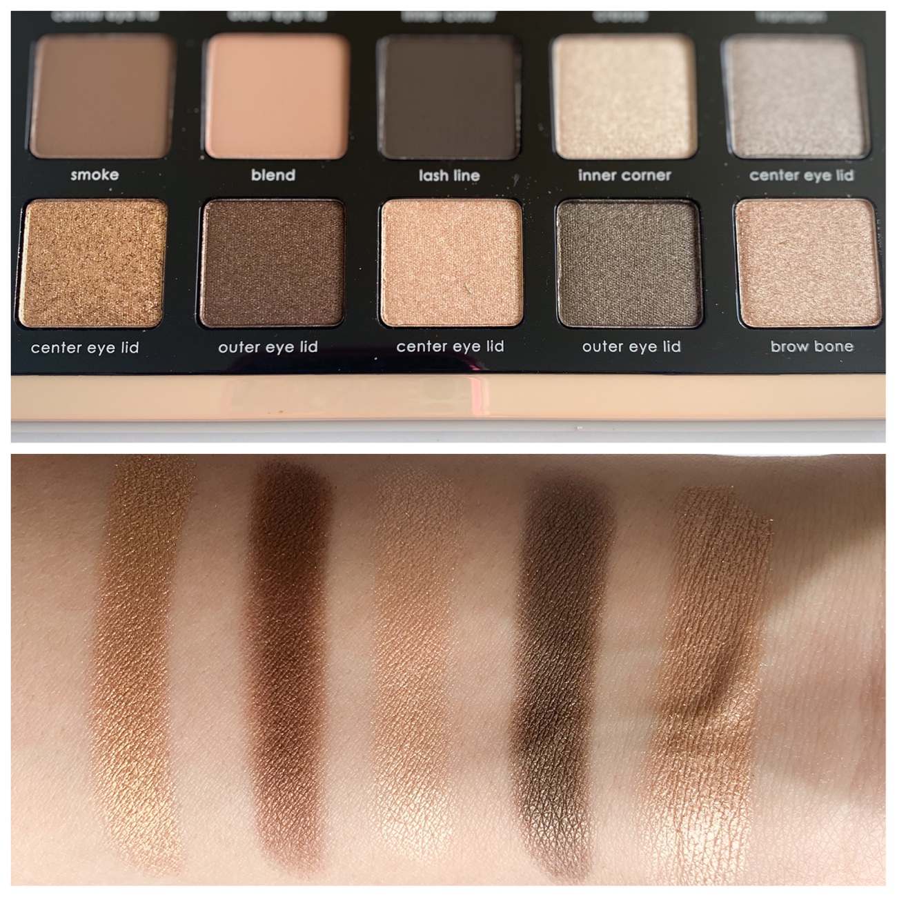
Middle row: 325CM – warm-toned, medium-dark taupe, 326CM – warm-toned, very light brown, 327CM – cool-toned, very dark taupe, 328M – warm-toned, light pewter, 329M – cool-toned, light-medium taupe.
Bottom row: 330M – warm-toned, medium-dark gold, 331M – warm-toned, dark brown, 332M – warm-toned, very light gold, 333M – warm-toned, medium-dark taupe, 334M – warm-toned, medium gold.
*all of the above shade descriptions are taken from Temptalia*
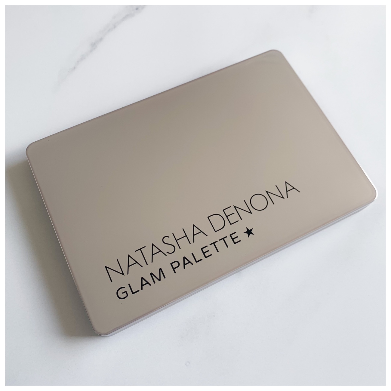
Natasha Denona Glam Eyeshadow Palette

Natasha Denona Glam Eyeshadow Palette
How I find it
Even though all the shades are not “named” they are labeled as to where you would most likely use it. Of course, you can use these shades however you want, there are no rules. But for a makeup beginner, I would say this palette is great. There are shade codes at the back of the box that it comes in and it just follows the number from 320 to 334 and then the same letter code to indicate whether the finish is creamy-matte (CM), metallic (M), or chroma crystal finish (K). There are 5 creamy-matte shades, 9 metallic shades, and 1 crystal shade. The Bronze palette had creamy powder and duo-chrome shades, but this palette does not.
There have been many discussions and reviews of this palette about how it is very much catered towards lighter skin tones because of the labeling of the transition shade, the crease shade, and crease shade. I think after all the discussions, Natasha Denona’s website had included the image above to demonstrate how the palette can be re-arranged to suit different skin tones. All the shades can be popped out from the back and put into your desired location or into another palette.

Shade re-arrangement suggestions according to skin tones
From the arm swatches, I can feel that the texture of the shades are all very consistent throughout the palette and also identical to the Bronze palette. They are all really creamy and does not bunch up. They do have a little bit of fall-out, but it is totally acceptable. There are a couple of shades that look much deeper in a swatch than in the pan, for example, Blend and Centre Eye Lid on the second row looks like quite light-toned, but is in fact quite medium-toned when swatched.
First row
Middle row
Bottom row
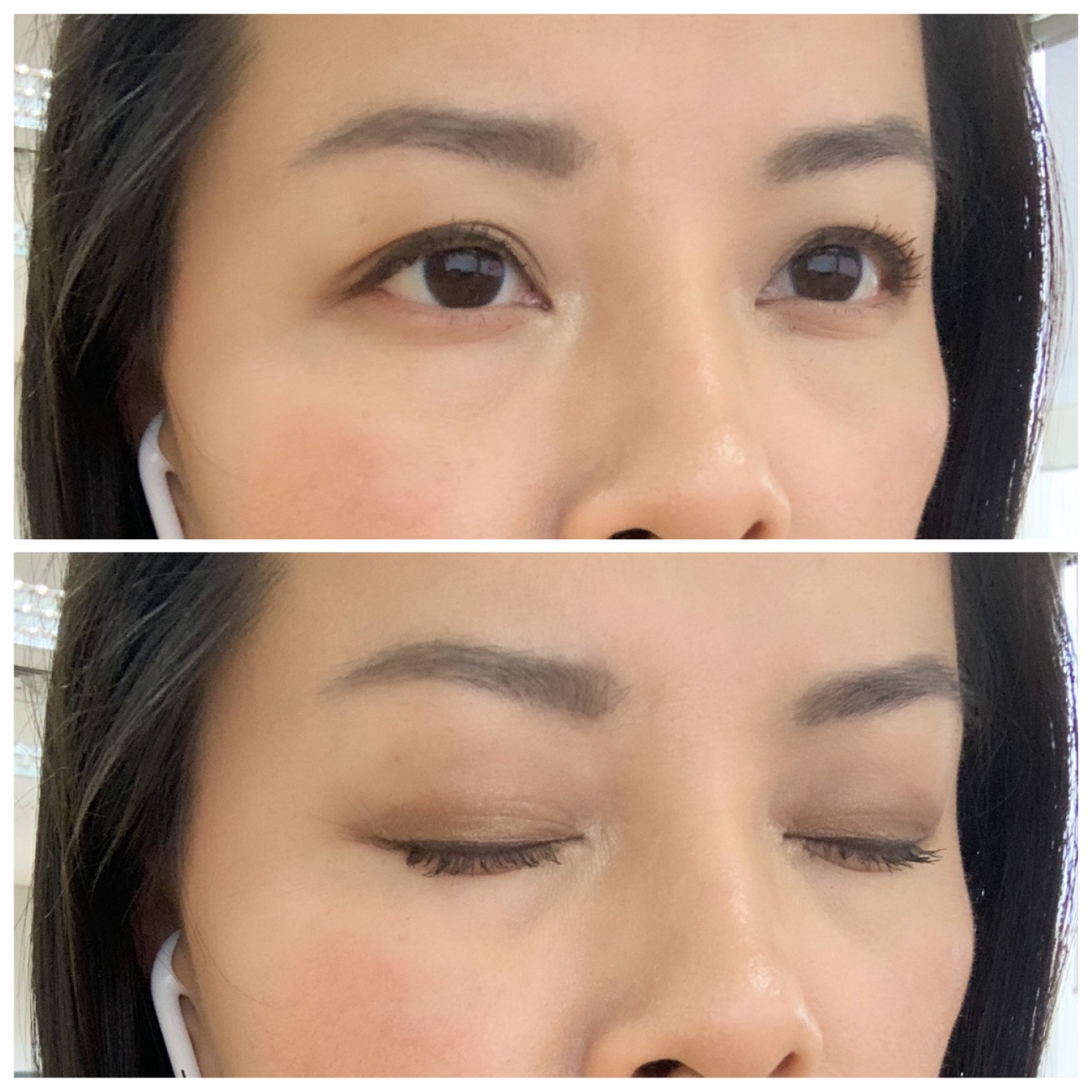
For the first look, I followed all the suggested shade locations and mainly using the top row for center eyelid, outer eyelid, and inner corner. I also tried the brow bone colour but it was a little too golden on my skin so I used the inner corner shade on the second row instead. The lash line shade as well, but ever so lightly and faded. I did not use any eyeliner for this look and it is much lighter and my eyes are less defined.
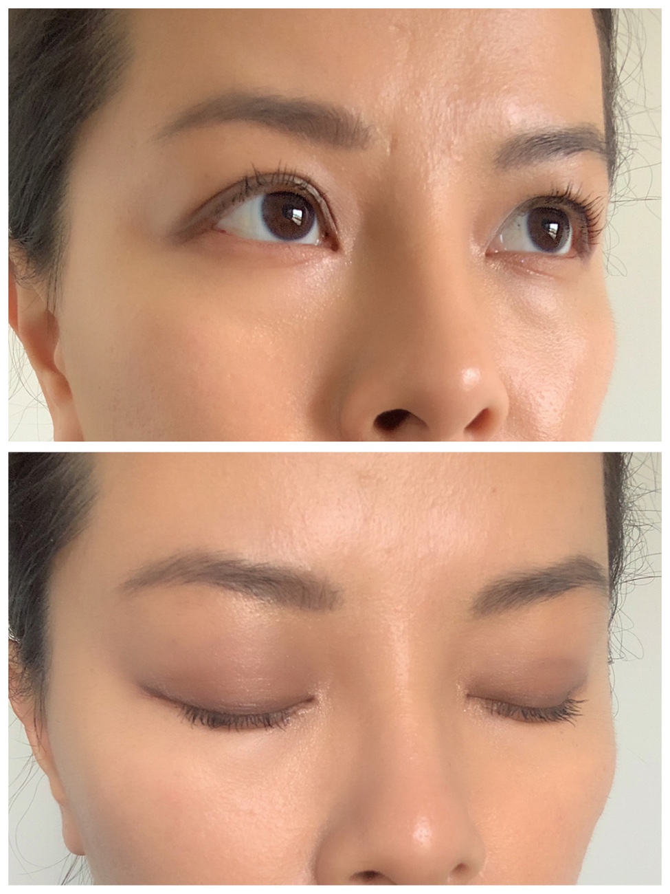
First look
The second look I did was with the bottoms right corner – outer eyelid and center eyelid. This corner is quite cool-toned compared to the top left corner. I skipped the lash line shade this time, but I used a gel eyeliner on my lashline.
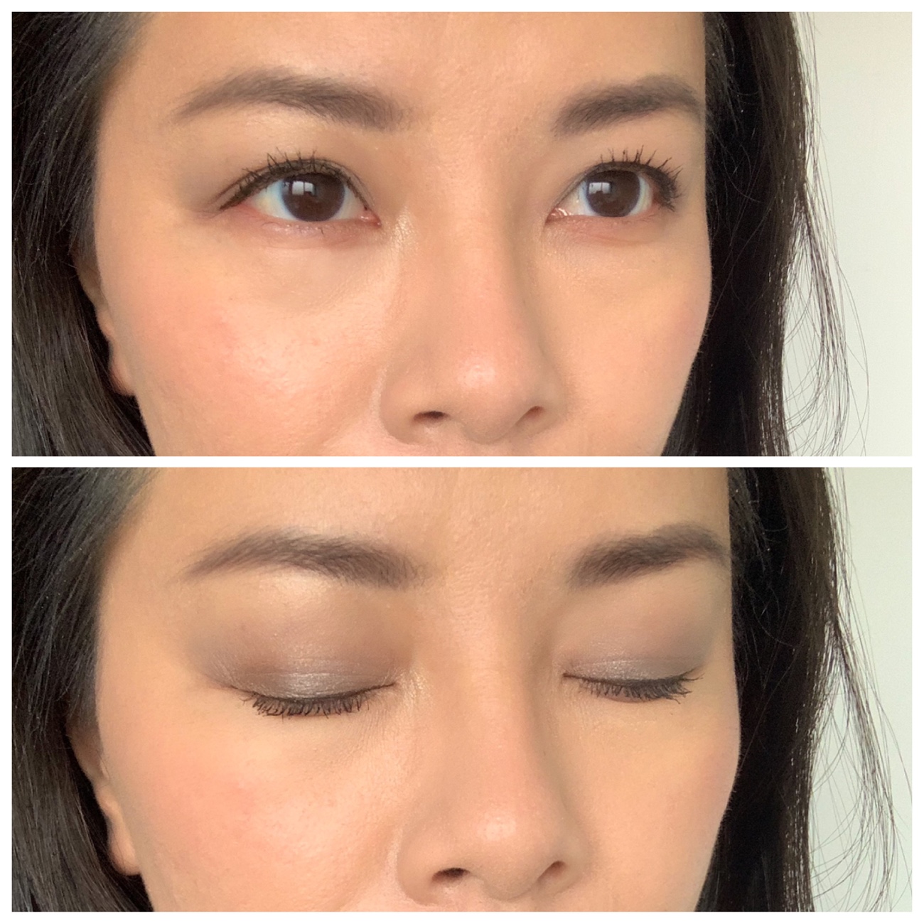
Second look
The third look is with the bottom left corner shades which are the warmer tones in this palette with the gold and brown. Then I used the inner corner shade from the top row because it is the warmer of the two available. I also used the inner corner shade on the top row because that is a warmer inner corner compared to the middle row. I used a liquid eyeliner on this look as well.
Overall
From the photos online, this palette does look really cool-toned, but when swatched, I can tell that this is quite neutral with a couple of slightly warm shades. As a light-medium skin toned person, I didn’t find the need to change up the shade layout and I am quite happy as it is. I often follow the shade suggestions and sometimes venture off a little bit as well.
After trying it out a couple of times, I decided that Blend and Smoke were a tad too dark for usual eye looks so I seldom reach for those. The formula of all the metallic shades are really good and they apply so much better with my fingertips than a brush in my opinion. The cool-toned shades looks quite awkward on me for some reason, maybe I am just not used it, but the neutral and slightly warmer toned shades are really nice and quite natural looking on the skin. Sometimes a brozne/golden look can be a bit dramatic and summery. A slightly neutral beige/taupe colour give my eye area natural dimension that they are more deep-set or contoured.


